Saturday, March 23, 2013

the first shot

The past 3 times I have gone for photo walks, my favorite images has been the first (or second) shot I take.  (Disclosure: I mean subject really, because I will "work a subject" with many photos to get the right shot.)  Not sure why my favorite has been so early because usually it is later when I get into a grove, but I find it interesting.

This was just supposed to be an example of compression to the people that were with me:


This was found in the parking lot as I waited for others to arrive.


Second shot (or second subject) and the reason I pulled over and parked here anyway.

Sunday, March 10, 2013

the fog I wanted

Yesterday (see that post here) I ventured out with a photo group to try B&W photography in the dreary and rainy weather.  I was hoping for fog and didn't get it.  But this morning was amazing! It even decided to hang around until after church for me to play in.  So I tried the same thing we did yesterday, only a different area of the UW Arboretum.


Fog is lovely because it shows depth.  The farther elements are from your camera, the softer they seam.  In B&W you can't rely on color to separate elements in your photo because there similar tones blend together, but here fog is doing that for me by creating different tones.


Saturday, March 9, 2013

B&W on a grey day

To be honest, I have been shooting a lot of photos recently...just all of my 8 month old daughter, so it was good to get out with the Black Hawk Church Photo Group and make some images.  (Granted as soon as I got home I took more photos of her, I just can't help myself.)  Our challenge was to create some B&W's on this dreary and slightly rainy day.  I was hoping for more rain actually, the more drastic the weather, the more dramatic the photos.  Oh well, still fun.


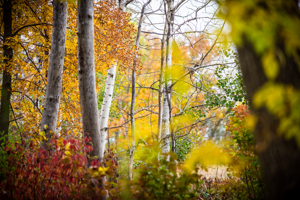
The UW Arboretum (where we want to hike) can feel a little messy....visually messy.  There are a lot of branches going all over the place that can cause photos to look very disorganized.  I tried to focus on shape, form, lines, and contrast.  With black and white you need to rely on the shape of your subject (pattern or form too) and not color to know what you are looking at, and having a good black and white point will contain your subject.  Too much of any of these elements and you get to disorganized.  Having too much was easy with so many branches and trees (all the same tone in B&W by the way) going in all different directions.  So I tried to simplify, and look for simple contrast.